Make It Obvious
When designing an application, make it obvious how to get started.
The canonical example of an obvious starting point:
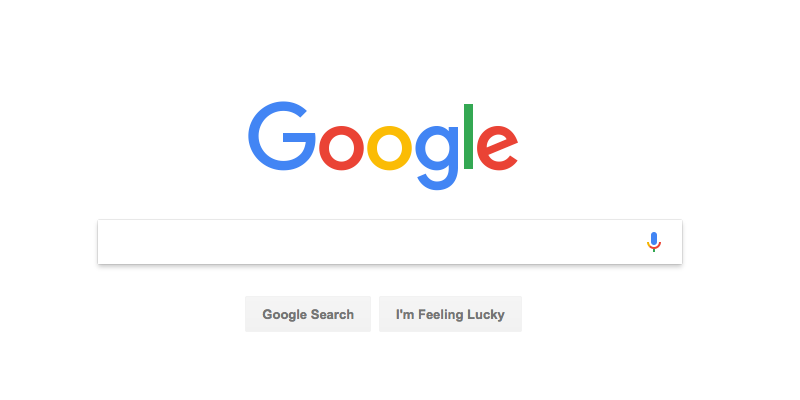
This is a recent capture of Google’s home page. The core design is nearly identical to the first version of the Google home page that debuted in 1998. Other than the branding, I think the only thing new is the microphone, which allows you to search with your voice.
At the time, portals ruled the world. All the search engines had a search field, but most of the page was taken up with lists of links.
Here is one current site that still uses this approach:
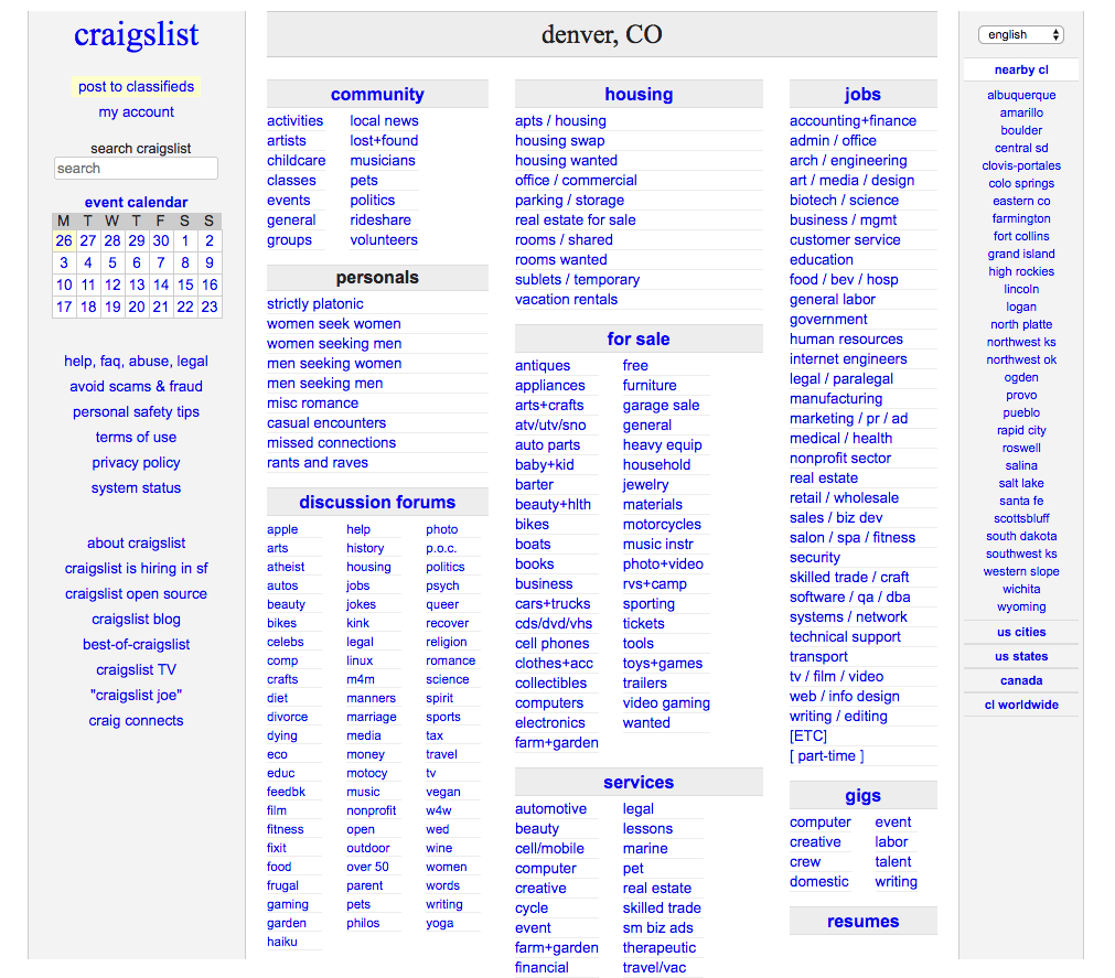
Seriously kids, this is what most of the web looked like in 1999.
All of Google’s competitors were using a design that looked a lot like Craigslist. (Anyone remember Lycos? AltaVista?)
Google’s design is superior because it’s obvious where to begin. Since the interface is limited to a single text field and a couple of buttons, you really have no choice but to just start typing. What else are you gonna do?
This design has been so successful, and so copied, for a number reasons. First, it makes it perfectly clear how to begin. Second, it sets expectations clearly. It says, “This is a search site,” loud and clear. And, given the size of the corpus being searched —the entire web— searching is a much more efficient way to navigate the space than clicking links into a deeply nested categorization scheme.
Not many people use the Google home page anymore, most people start searches in their browser. But credit Google for keeping this design and not watering it down with links to their other products.
Another Example
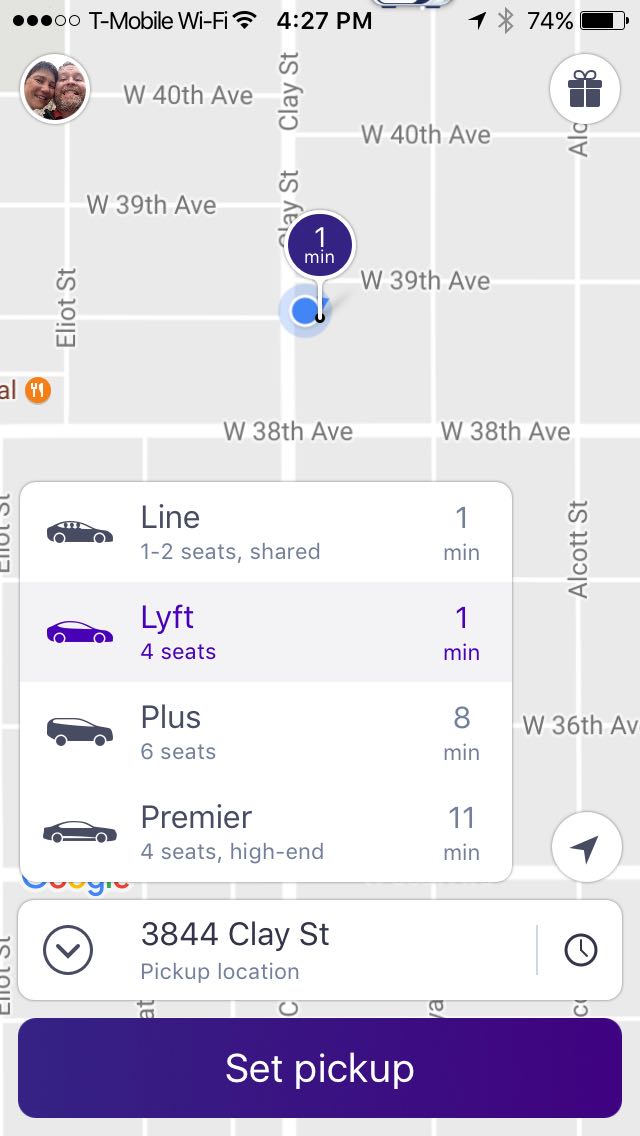
Lyft is also doing a fine job getting you started. The app is using your location to set the pickup point and the big purple ‘Set pickup’ button is hard to miss.
This screen is also a study in the use of intelligent defaults. Most of the time, you are going to want to be picked up at or near your current location. Most people want to be picked up now, and this is also the default. (You can click the clock icon to schedule a later pickup.) And most people are going to take a standard Lyft, but the other types of rides are listed, too.
There is another starting point here, the gift icon in the upper right. This allows you to invite other people to join Lyft. And by doing so you can earn rewards: discounted or free rides.
The gift icon is bit confusing. My assumption was that clicking it would allow me to buy a ride for a friend as a gift. They seem to be using it to mean “earn rewards,” but gifts are given not earned… This would probably be more clear with a text label “Invite Friends” than an icon. Hard to imagine an icon that clearly communicates “invite friends.”
Note the relative weights of the elements on screen. The button is the first thing you notice, then the map pin and current location marker, then the choice of ride types, then the search field where you set the pickup location. This hierarchy supports the user’s goals. The only control you have to interact is the button, and you aren’t gonna miss it. The pickup location is also important, you need to know where the car will be waiting. The other elements are less important. They are used less often, and the visual presentation supports this.
On other thing to notice about the app: its ergonomics. The most important control, the big button, is at the bottom of the screen. Why the bottom? Because it is easy to reach with your thumb when holding the phone with one hand.
You may be thinking that it’s easy for Google and Lyft to be obvious because they each do only one thing. This is true, as far as it goes. Your job as a designer is to focus the app, to figure out which features are most important and most used and put those front and center. This is what making things obvious is all about.
Wrapping Up
UX designers: you are trying to create a focus for each page or screen. To do this you need to understand your users and the tasks they want to accomplish. It means reducing the the cognitive load of the page, giving users less stuff to parse and understand. Often it means creating separating UX for each task, with links between them where it makes sense.
Product people: this also requires an understanding of your application’s users and the tasks they want to achieve. It argues for restraint in the features you add to the product.
Another great article about obvious design: Obvious Always Wins by Luke Wroblewski.