
You Think Your Website Looks Like This…
It’s a safe bet that a substantial amount of your site’s traffic is coming from mobile devices. It’s a sure thing that your mobile numbers are growing while desktop is shrinking. Let’s go to the charts.
Internet Usage Worldwide, March 2009 to May 2017
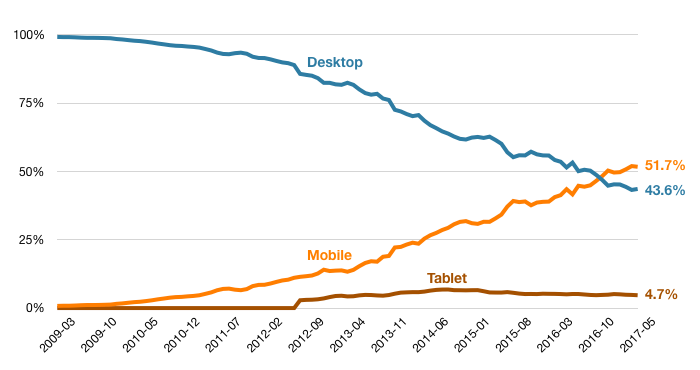
Source: StatCounter GlobalStats (see note 1 below)
In October of 2016, the lines cross and mobile surpasses desktop. The numbers are a little different in the US, but the basic story is the same.
Internet Usage U.S., March 2009 to May 2017
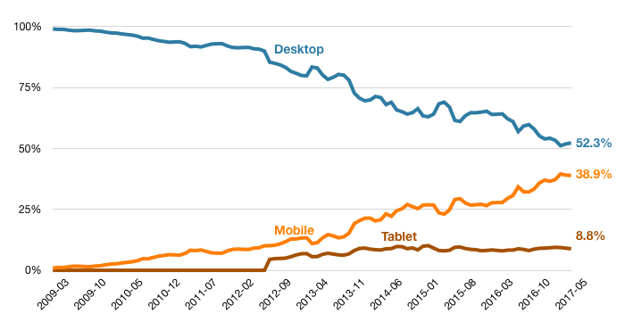
Source: StatCounter GlobalStats
In the U.S. desktop still has the lead, but it is eroding. And there are plenty of other signals that mobile web usage is growing. For example, this post on Google’s AdWords blog from May 2015, where the company writes, “In fact, more Google searches take place on mobile devices than on computers in 10 countries including the US and Japan.”
And we all kind of know this, at least intellectually. But it’s different to internalize it and act on it.
I was speaking with a colleague Jason Rogers recently, and he put it very succinctly:
“People think their website looks like this.”
“When it actually looks like this.”

Jason demonstrated the differences by drawing rectangles on a whiteboard, a fat wide one for desktop and tall skinny one for mobile.
It spoke to me about the disconnect between what we know and what we believe. How intellectual knowledge may fail to motivate us to take action. We know mobile is growing and desktop is shrinking, but we often act as if the desktop view is the “real” version.
We were talking about this in the context of form conversion. And yeah, mobile conversion rates are often lower. But when you look at it through this lens, it’s not really a mystery why. It’s the difference between having a responsive site and committing to a mobile first design.
Notes:
1. StatCounter are a bit vague about what they are actually measuring. Their press release announcing this milestone refers to “internet usage”. Their FAQ explains, “Our tracking code is installed on more than 2.5 million sites globally.” So I think those charts are tracking website visits.
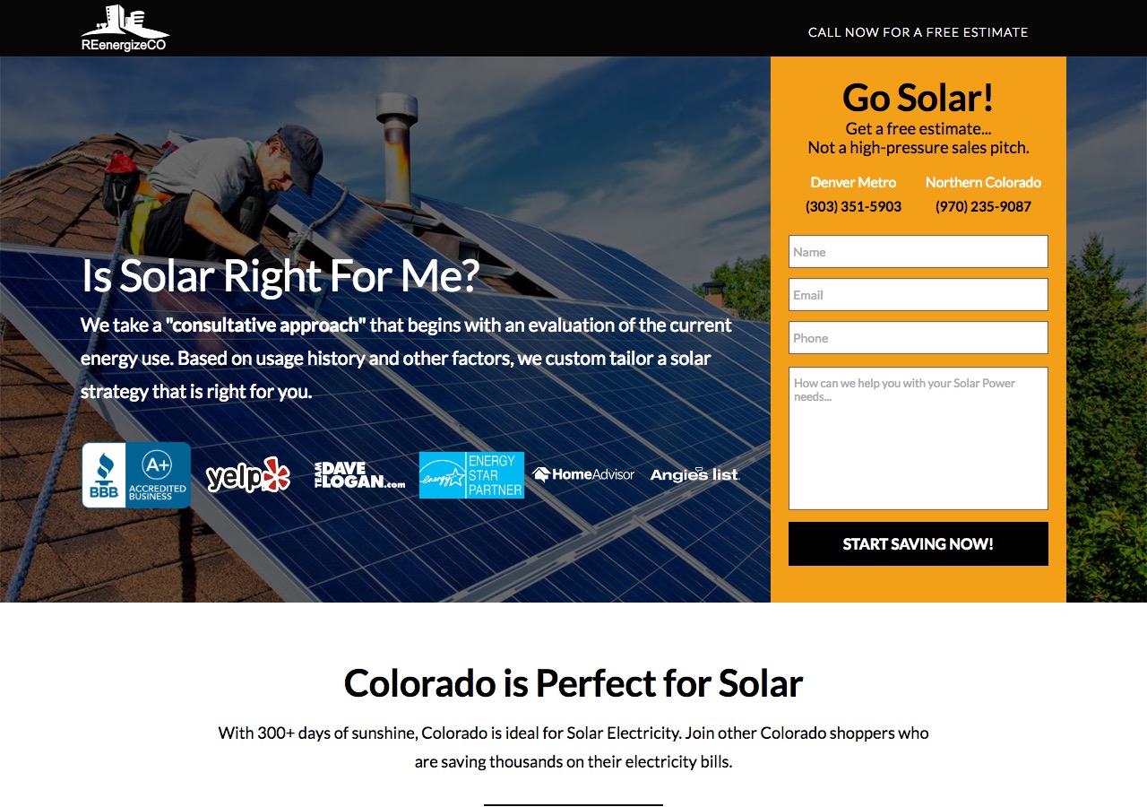
2. In the example solar site, the entire form is below the fold in mobile. The mobile layout feels like an afterthought.