
Sparse Details Pages
A redesign of a problematic page.
From 2005 to 2011 I worked at Local Matters. The company had a platform that we used to build local search sites for yellow page (directory) companies all over the world.
By 2009, when this redesign took place, I had worked with Dex in US and clients in Ireland, Belgium, Holland, Portugal and Helsinki. And we kept seeing the same problem: business details pages that looked empty or poorly laid out.
Local Matters had clients in New Zealand, Austria, the Czech Republic, Denmark, Poland, Slovakia and Sweden. Most of these had the same issues.
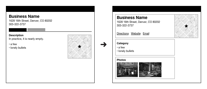
The Cause: Using Tabs to Organize Content
The way these directory business work is that they sell adds to local businesses. They have some basic information on every business, but they have a lot more info about their advertisers. So we had a situation where some businesses had a lot of content and some had very little. A successful design would accommodate this range.
Time and again, I’d meet with clients when designing their details pages and they’d want to use tabs to organize the content. This made sense. Tabs are a well understood navigation pattern, and they were pretty visible on the pages.
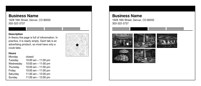
But beyond the basic information about the business –the name, address and phone number– most of the other content was sold as an advertising product, like photos, or only collected from advertisers, like hours of operation. And they had tiers of advertisers. The top tier would have a bunch of advertising content to show. The next tier down would have less.
Using tabs worked OK for the top tier. Their pages were full of content. But as we looked at lower tiers and the free listings, the tabs would take a small amount of content and spread it over a several pages. The result was most pages looked pretty sparse.
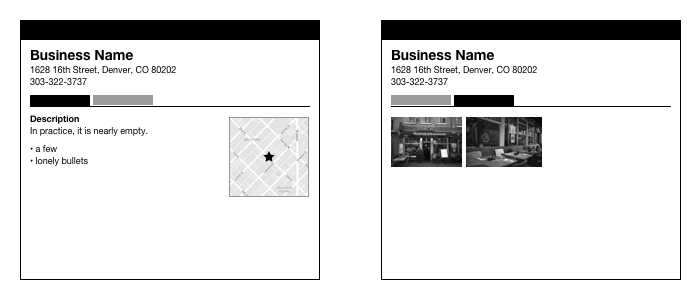
However, the clients would tend to fixate on the top tier. These were their best customers. They would tend to discount how uncommon these were.
A Better Solution: Stacks of Content
By 2009, I been thru this cycle enough. I wasn’t having any luck convincing client not to use tabs using ad hoc approaches. I began to research alternatives.
Amazon’s product pages were the inspiration for what I came to call “stacks”. On their product pages, Amazon dedicates a horizontal section or stack of the page to each kind of content they have.
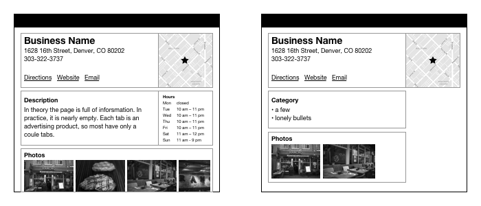
This design handled the range of content much better. Having a name for it helped sell it to clients. Showing examples of other yellow page site with the problem also helped sell the solution.
I didn’t design this page, but it’s from one of the Dutch companies I worked with. It’s a good example of stacks on a details page.
I wrote about some of the challenges of working in the directory industry in this post: The Other Kind of Research.