
Responsive by Default Layouts
Media queries? We don't need no stinking media queries.
I was learning more about flex box, when I came across an interesting article on Smashing Magazine, Using Media Queries For Responsive Design In 2018 by the brilliant Rachel Andrew. In it, she explains the “responsive by default” properties that flex and grid layouts can have.
I’m gonna focus on flex layouts, rather than grid. I know grid is the new hotness, but for now, I’m sticking with flex because the browser support is better.
A Working Example
Have a look at this sample page. If the window is larger than 640 pixels wide, the picture and text are side by side. Smaller than that, and the picture is above the text. All of this is done without any media queries. (If you are on a mobile device, rotate your phone into landscape to see the side-by-side layout.)
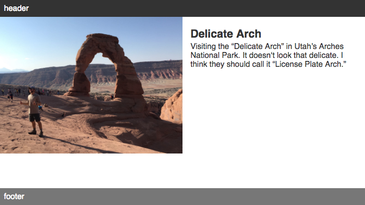
iPhone 8 in landscape, window is 736 pixels wide
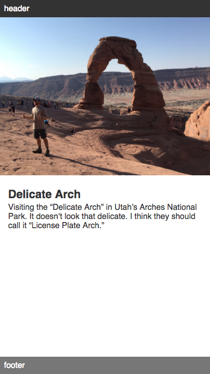
iPhone 8 in portrait, window is 414 pixels wide
The HTML
<div class="wrap">
	<div class="image">
		<img src="/img/arches-delicate-1-thumbs-up.jpg">
	</div>
	<div class="text">
		<p class="title">Delicate Arch</p>
		<p>Visiting the “Delicate Arch” in Utah’s Arches National Park. It doesn‘t look that delicate. I think they should call it “License Plate Arch.”</p>
	</div>
</div>
The CSS
.wrap {
	display: flex;
	flex-wrap: wrap;
}

.wrap > * {
	flex: 1 1 320px;
}
The first rule display: flex establishes our flex container. The second declaration flex-wrap: wrap allows the items within it to wrap to new lines rather than just overflowing and being clipped by the flex container. (The default behavior is flex-wrap: nowrap.)
But the real key is the second rule flex: 1 1 320px. We are applying this to the direct children of the flex container, our flex items. It’s using the flex shorthand to set the flex-grow, flex-shrink and flex-basis properties at the same time.
Flex-grow and flex-shrink set up proportions for each of the flex items. Here we are making them all equal, so the image and text are the same width. They each take up 50% of the width of the container. If we wanted the image to be twice as wide the text, we’d set its flex-grow to 2 and leave the text at 1. More on flex-shrink in a minute.
What is flex-basis?
According to the spec, the flex-basis property sets the “the initial main size of the flex item”. Which is pretty much clear as mud. In practice, when set to a length, the flex-basis sets the minimum width of the object (or the height when using flex columns instead of rows).
In practice, when set to a length, the flex-basis sets the minimum width of the object
In our example, we have a flex container with two items. Each item has a flex-basis of 320px. When the container is wider than 640 pixels (320 × 2), the items display side-by-side. But if the container is narrower, then the second item pops down to the next line. That’s what flex-wrap: wrap is doing. Without this, in a narrower window, part of the text would be clipped by the viewport, and the page would scroll horizontally.
And because we set the flex items to grow, they expand to fill the available space. In a window that’s 1000 pixels wide, each item would be 500 pixels wide. But interestingly, in a 400 pixel widow, each item wraps onto its own line, but the components still expand to fill the available width. Each item will be 400 pixels wide, each filling the width of the container.
Wrapping Up
Using flex-basis allows you to define a minimum width for the items. If there isn’t enough room, the items will wrap onto their own lines, yet each still fills the space available. That’s the basis for a responsive layout. (And grid has a very similar property, min-max:, that can be used to achieve similar results.)
Extra Credit
You may have noticed that we set flex-shrink to 1, which allows the items to shrink. We could have set it to 0, which would prevent them from shrinking. To see a difference, you have make the container narrower than 320 pixels. Allowing the items to shrink means that in a 300 pixel wide container, each flex item shrinks to 300 pixels wide. If they can’t shrink, then 320 pixels is the minimum size and in a narrower container the items would be clipped on their right edges.
The sample page is also using flex box to achieve a sticky footer. It’s adapted from this page. View the source to see the CSS applied to the <body> and <main> elements,
Originally published on the moonsault blog