
Simplify Forms to Increase Conversion Rates
Examining how form complexity affects conversion rates.
At Moonsault we have worked on several landing page / lead generation projects this year. And one thing keeps coming up. Clients want to add a whole bunch of fields to their lead generation forms. Which is bad for conversion.
The canonical conversion reference seems to be this post at Quick Sprout by Neil Patel. It gets linked to frequently in the context of form conversion and the number of fields.
I’m not sure this should be the canonical reference, since it’s based on a single study, an anecdote really. And if you follow that link, be ready to get assaulted by some shady up-sell tactics.
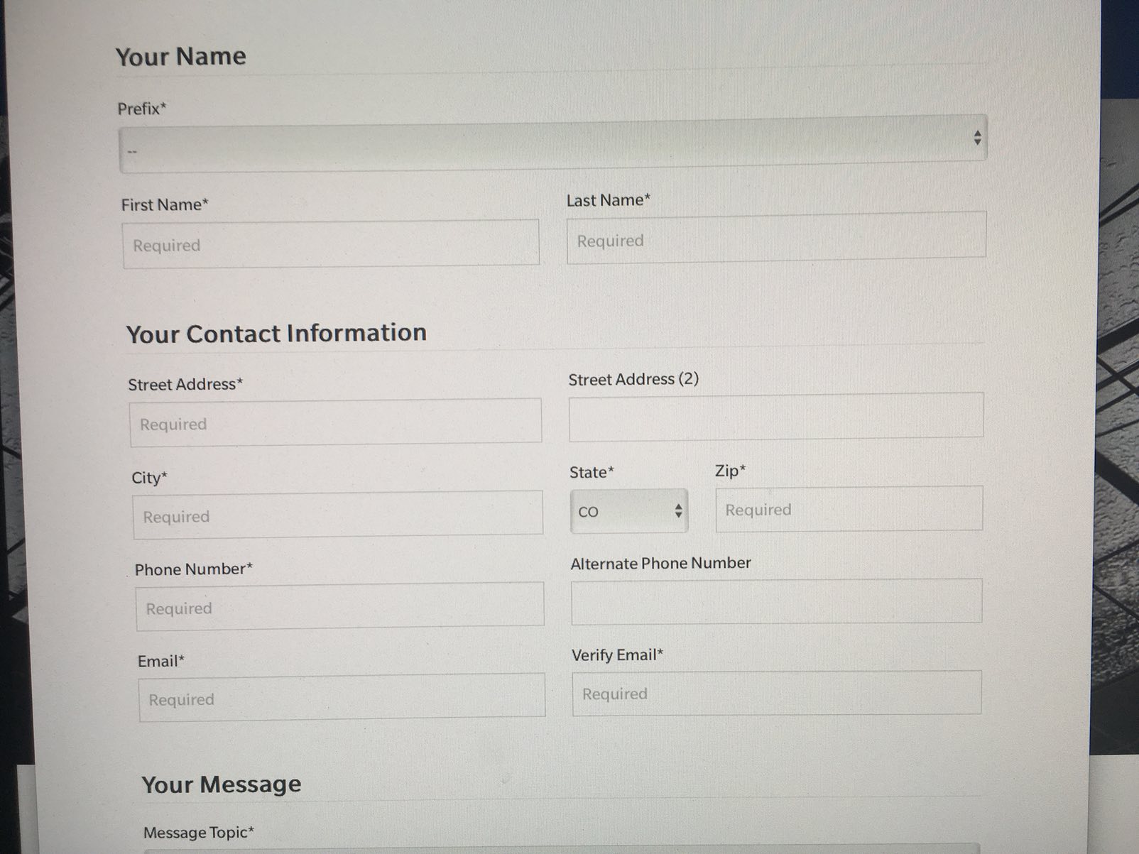
This monstrosity is part of the contact form for emailing my senator.
His contact form initially had four fields: name, email, URL and revenue. He removed one field, revenue, and increased conversion by 26%.
Fewer fields are better because it’s less work to submit the form. But there also a Don’t Make Me Think aspect to this story. Neil stopped asking the one question that users had to think about to answer. All the other fields could be filled in without much thought. But asking about revenue makes you wonder, “Why are they asking about revenue?” and probably also “Do I want to answer this question?” Even if you are OK sharing the information, you’d likely have to ask yourself “What is my revenue, anyway?” This requires a lot more cognitive work than the name field does.
That’s the main takeaway from this essay. To improve form conversion, reduce the cognitive work needed to complete the form. Reducing the number of fields is a great way to do this. But it is not the only way.
To improve form conversion, reduce the cognitive work needed to complete the form.
There are many other posts that talk about the number of form fields. Some of these contain contradictory advice. Many are drawn from very little data.
This PDF from FormStack has a lot of good information, though. Particularly the part about how different kinds of forms, surveys, contact, payment and so on, have different numbers of fields on average and different conversion rates.
UX Research on Form Design
My background is in UX, so I tend to view form conversion through that lens. And UX folks have been studying forms for a long time.
This article from the Nielsen/Norman Group, run by design legends Jakob Nielsen and Don Norman, summarizes their current recommendations:
-
Keep forms short. Reducing the number of fields increases the conversion rate.
-
Labels should be close to the fields they describe. Ideally immediately above the field.
-
Use a single column layout, with a separate row for each field.
-
Present fields and options in a logical sequence. Group related fields, like credit card number, expiration date and security code. For multiple choice options, present the most commonly used choices first. If you are asking for a country and most of your users are in the U.S. show “United States” at or near the top of the list, instead of alphabetically with the U’s.
-
Avoid placeholder text. Nielsen/Norman have a whole article about this. Using placeholder text instead of field labels has a host of problems. Using it with field labels also hurts usability by making it harder to tell which fields have been filled out.
-
Make fields the ‘right’ size and use the correct inputs. Text fields should be about the size of the expected input. Use radio buttons rather than drop-down menus if there are two to three options. Radio buttons operate with a single click or tap and all options are visible.
-
Distinguish between optional and required fields. Eliminate as many optional fields as you can, and label any that remain.
-
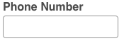
Explain any input or formatting rules. Don’t make users guess about obscure password rules, tell them the required characters up front before the error. Likewise, either allow users to enter phone numbers how they like (using or omitting dashes and parentheses) or explain clearly how they must be entered. Better yet, use an input mask, to guide user input, more on those below.
-
Don’t use a reset or clear button. Providing a simple one-click way to empty all the form fields is a terrible idea. People will hurt themselves.
-
Make error messages clear and highly noticeable. Don’t rely on color alone and don’t be subtle.
All of these guidelines will affect form conversion rates. The main thing to remember when designing forms is that people don’t like filling out forms. The longer and more complicated a form looks, the less engaging it will be.
Alternative Controls
Luke Wroblewski is a heavyweight in UX circles. He literally wrote the book on Web Form Design.
Luke’s post on avoiding drop-downs in mobile forms has some great ideas for making forms shorter and less complex. Luke shows how using alternative controls, like steppers, segmented controls and switches makes forms easier to use.
Steppers


Segmented Control

Switch

Input Masks
Luke also writes about using input masks to help guide the user when entering dates, phone numbers or other data with formatting rules.
Input masks don’t affect the initial display of the field.
When you click on the field and start typing, the mask adds the formatting automatically.
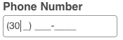
Not only do they help people enter the data, input masks also prevent people from entering characters that are not allowed. They aid in data validation and prevent a possible source of error.
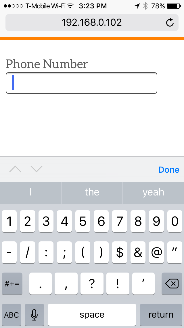
Appropriate (Virtual) Keyboards
Another way to prevent errors, at least on mobile devices, is to show the right virtual keyboard. If you are asking for a number (a phone number, a credit card number or currency) you can display a keyboard that contains only numbers. This prevents errors and provides larger tap targets, making the form easier to use.
For example, this code…
<input type="number" name="phone">
…triggers this keyboard.
This is a number keyboard, but it’s not the best number keyboard available. Both iOS and Android provide a numeric keyboard that has larger keys and no symbols.
The following code will trigger a more usable keyboard.
<input type="tel" name="phone">
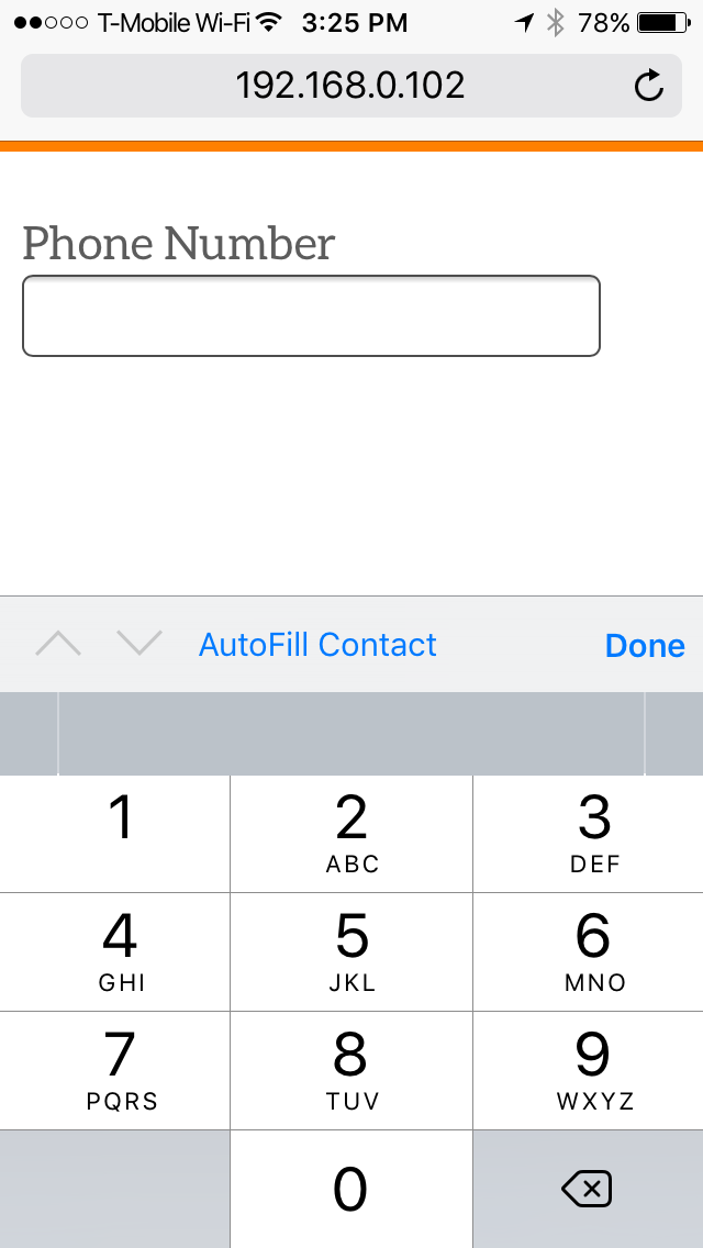
Note that there aren’t keys to enter a decimal point or a negative number.
On iOS devices, you can also use this code.
<input type="number" pattern="\d*" name="phone">
You can also use pattern="[0-9]*" but this only works on iOS devices. Use type=tel if you want s solution that works on both Android and Apple devices.
Autocomplete
UX Booth has a good article about form design that covers input masks, placeholder text and triggering the right keyboard. It also covers a tip for simplifying the collection of addresses that we have been using at Moonsault.
By using the Google Maps API, you can collect an address in a single field by using Place Autocomplete.
The address field is a standard text field, but when the user starts typing an autocomplete menu is attached.
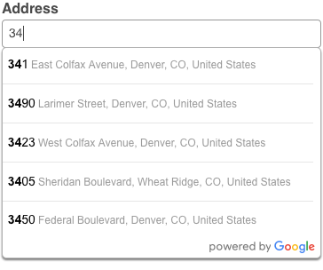
When the user makes a selection you get back the component parts of the location they chose: the street address, city, state, zip (or postal) code and country. You can add these to hidden fields in your form.
As the UX Booth article points out, the Google Maps API does not support unit numbers. So if you are using this in a place where you need to the address exactly right, like a shipping address, you may want to have the location populate visible fields, so that the user can correct or append a unit number. See an example of this in Google’s API documentation.
Conclusion
The best way to improve form conversion is to make the form as simple as possible. You should reduce the number of fields to the bare minimum. Remember that some questions require more work to answer, and that our real goal is to make the form as easy to fill out as possible. Choosing the right controls simplifies the form and makes it easier to use, as do input masks. Help the user by triggering the right keyboard and by offering autocomplete where possible.
One last tip, if you are asking for a name use a single name field instead of separate first and last name fields. A single field is easier to work with and there are many people with names that can’t easily be spilt into first and last names, like: Yao Bing Chong and David H. Miller Jr.