
Good Data, Bad Design
The Colorado Department of Public Health & Environment (CDPHE) has been publishing data about the COVID pandemic since early March. They recently updated the site, and are publishing a lot more data. However, the design of the site hinders discovery of this data and makes it hard to use / understand. This applies to both the visual design (how it looks) and how it works.
Visual Design Problems
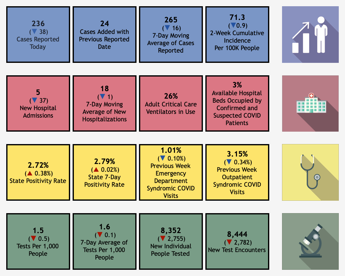
Here is the “meat” of the current display. (I’m omitting the navigation portions, which has problems covered below.)
current display
The main flaws in the visual design are:
- too many colors
- borders around everything
The overuse of color makes the diagram hard to look at. It looks unprofessional. Putting everything in a box with a border makes it harder to scan and compare values. (Edward Tufte calls these “content jails.” Each bit of data is visually locked up and isolated from the others.)
Improved Visual Design
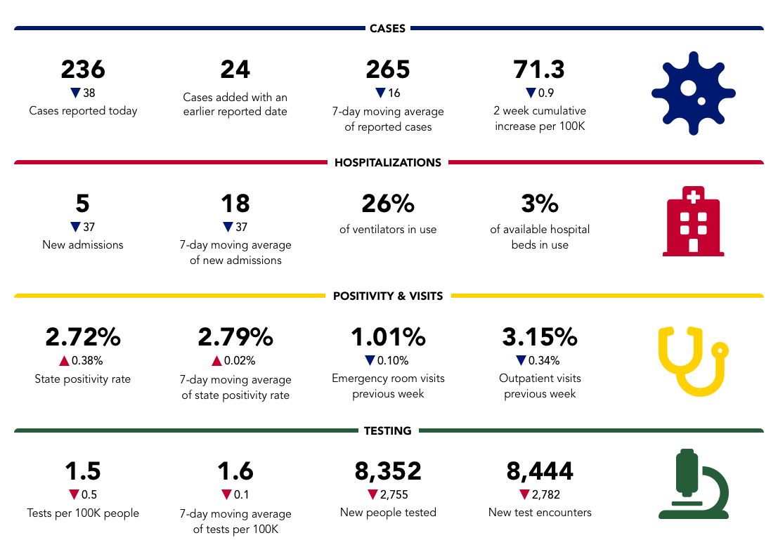
improved display
I kept the color coding of each section, but limited it to the separator between sections, and the icons. I used a darker more saturated version of the colors, that I pulled from the logo at the top of the page. The icons are from Font Awesome, an excellent source of free icons. In the original, the icons use a slightly different color than the rows, which is distracting and ugly.
I eliminated the boxes around everything, and instead used white space to separate values. This is almost always a better solution.
I also improved the typography. The numbers are larger and bold, to make them stand out. The labels are smaller. This is the biggest problem with the typography of the original, the values and labels are styled the same.
In the original, the sections don’t have text titles, instead each has an icon on the right. Text tiles work much better.
I dropped the light gray background. It didn’t quite match the gray in the header of the pages, and muddied the colors used. This also improves the accessibility of the display, by improving the contrast between foreground and background.
Awkward Navigation
Here is a screen shot of the page containing this infographic.
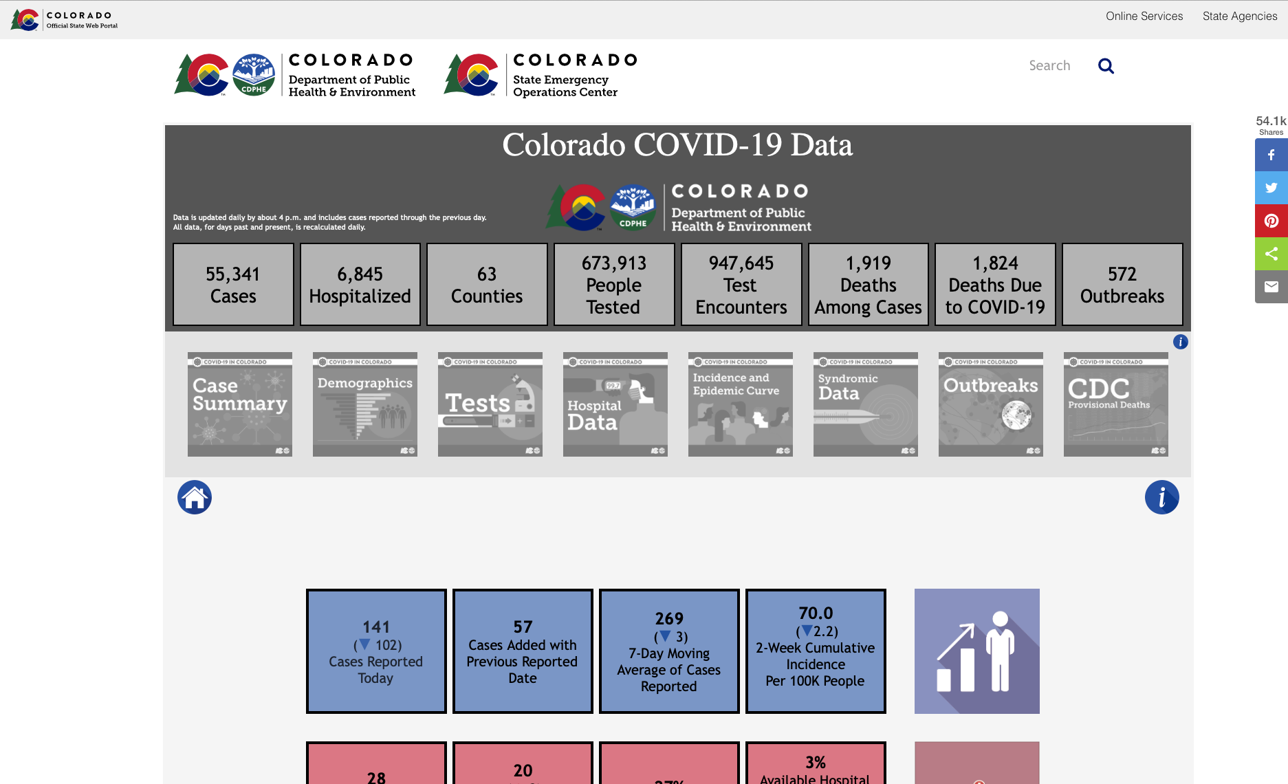
current page
The Colorado logo is repeated three times at the top of the page, and the key stats are again all in boxes, with identical type treatment given to the numbers and labels. Below this is a line of grayed out graphics that serves as the navigation to see the other data presented. It seems like we are on the Case Summary Page, but we aren’t. We are on the “home” page of this infographic, reachable by clicking the house icon just below the grayed out images.
This navigation is non-standard. It’s not obvious that the grayed out images are clickable. They take up a lot of space, and are visually loud. And the default state isn’t in the main nav, instead it uses a button below.
The most serious problem with the navigation is slowness. It takes several seconds to load each new state. Anything longer than about half a second feels slow.
Improved Navigation
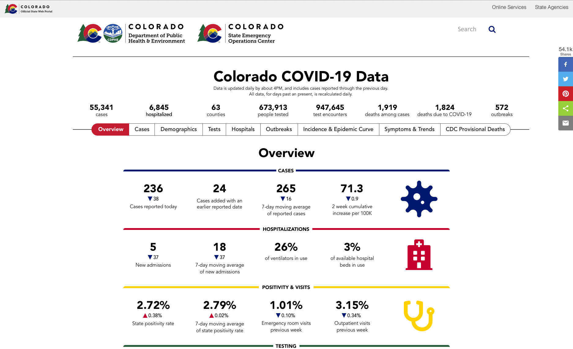
improved page
This version uses a ’segmented control’ for the navigation. With this control, each state has a button, and the active state is highlighted. It’s much more space efficient. I also changed the language used for some of the labels. I changed ‘Case Summary’ to ‘Cases’ because summary could be confused with ‘Overview’, the name I gave to the initial state. I used ‘Hospitals’ rather than ‘Hospital Data’ to make the labels more similar, most of them are plural nouns. And I grouped all these plural nouns together.
Also, the controls used on may of the graphs are also confusing, as shown below.
Make the Buttons Bigger
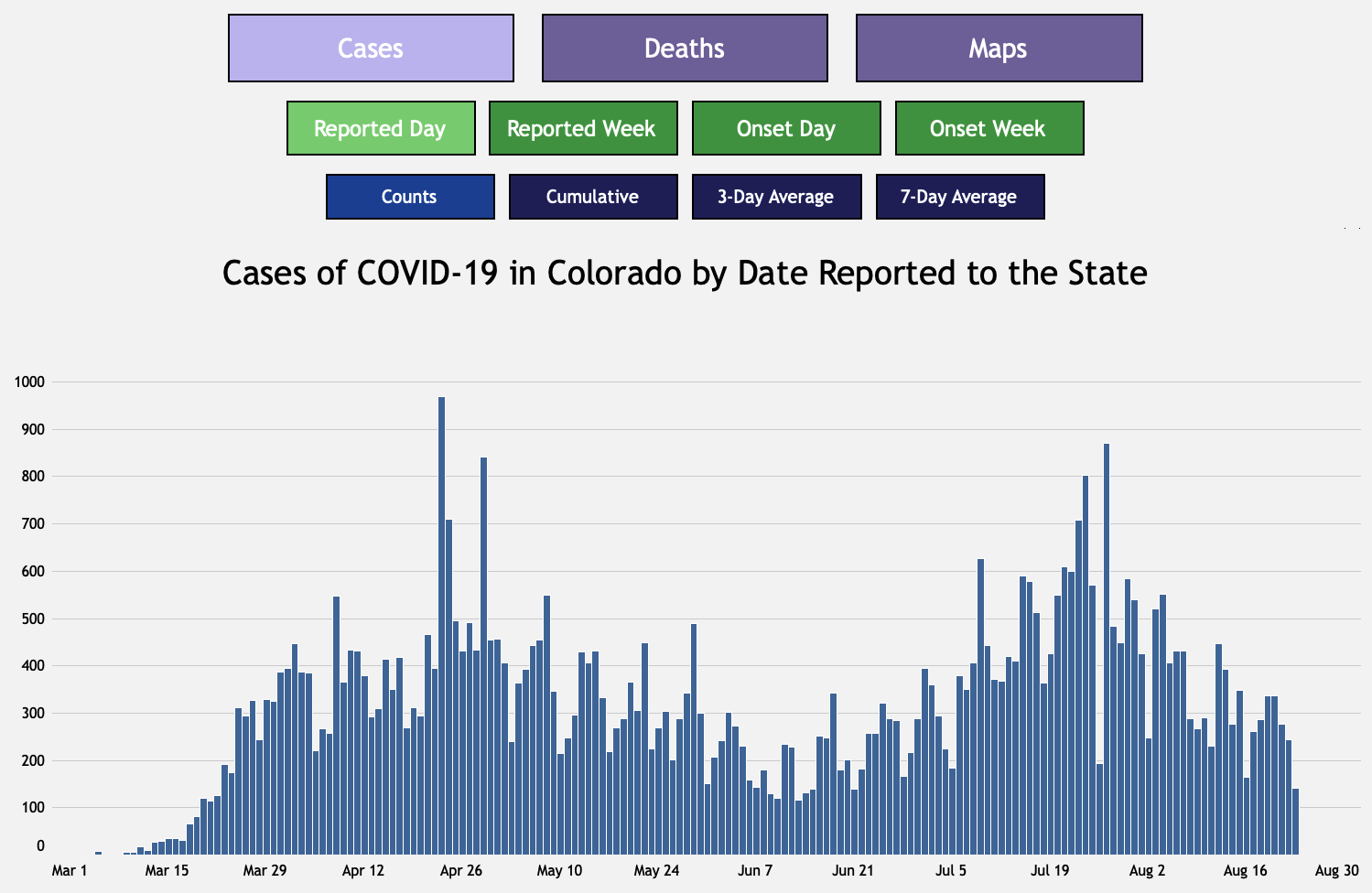
current controls
The buttons above this graph control the data shown on it. There is a hierarchy, the option selected in the top row affects the options offered in the second row.
However, using size to show this relationship is odd. More problematic is the use of different colors, and different active colors for each row. It’s not immediately obvious what is active. The viewer has to figure out what the active color is for each row, and every graph uses a different set of colors, which is madness.
Improved Buttons
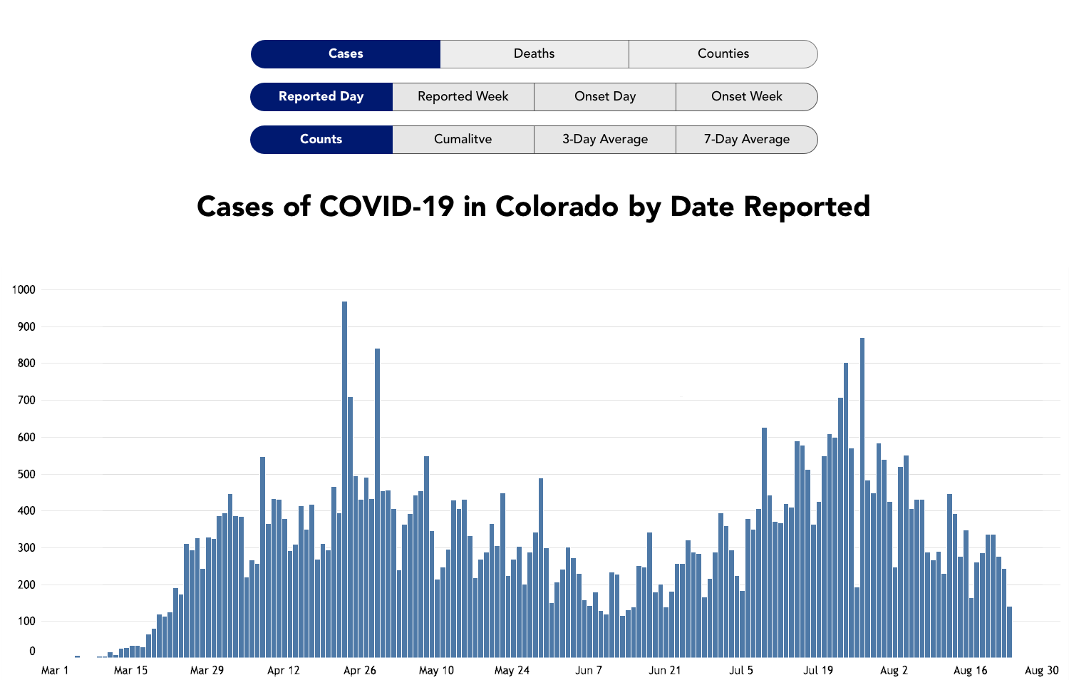
improved controls
Instead of using size, we can rely of position alone, and use a consistent color for the selected state across all the controls.
All of my changes reduce clutter on the page, make it more obvious what state is active, and require less mental effort to use.
If anyone from CDPHE is reading this, please feel free to use my improvements, or contact me for more design help john@infomongo.com.