Problems We Identified
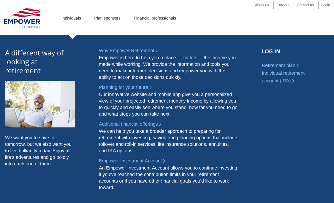
The site lacked consistent global navigation. On the home page, the header had three main sections: Individuals, Plan sponsors, and Financial professionals. Once you clicked into any of these sections, the navigation changed to feature the three top-level pages in the section.
the header on the home page
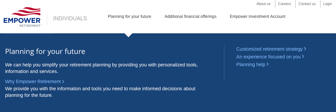
the header for the “individuals” section
The main drawback to this approach is that it makes it difficult to switch sections. Once you are in a section, you have to return to the home page, by clicking the logo, to access a different section.
The Empower team wasn’t that concerned with this because each section of the site represented one of their key audiences. Actual users weren’t likely to need to switch between the sections. While this is true, I wanted to design a navigation scheme that was consistent, if possible.
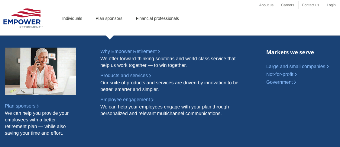
The site used mega menus for navigation, but they didn’t perform very well. And due to the lack of consistent global navigation, the menus weren’t consistent either. You’d get a different set when you drilled into the individuals section, or any of the other sections.
the individuals mega menu
the plan sponsors mega menu
the planning for your future mega menu, in the individuals section
These menus looked and worked more like small pages. They had too much text, and too few links. They were difficult to scan.
Inflexible Navigation Pattern
Other than the text links, the only navigation used on the site were boxes that looked like this:
navigational “boxes”
This wasn’t very flexible, and it was poorly designed or implemented. Only the “learn more” links were clickable. A better design would have made the whole box clickable, or at least the photo and headline.
Pages Without Useful Content
There were pages that had very little content other than these navigational “boxes”. The content inventory showed that these pages could be removed without losing any useful information.
site map, with pages to be removed highlighted
simplified site map
Both of these site maps are somewhat simplified. They don’t reflect the number of pages in each section, but show the change to the page hierarchy.
Wireframes
I developed twelve different navigational schemes, before we landed on the one we selected. Most of them we reviewed internally and discarded. We showed maybe five or six to Empower.
the new individuals mega menu
the new plan sponsors mega menu
Because of the poorly designed mega menus on the live site, the whole team, myself included, was somewhat reluctant to explore this approach. But once I was able to convince the team that a level of pages could be omitted, it became clear that this approach worked best.
For example, on the live site, there was a “Planning for your future” page. It had only a paragraph of text, and navigational boxes linking to the following pages:
- An Experience Focused On You
- Customized Retirement Strategy
- Planning Help
Mega menus allowed us to omit the “Planning for your future” page. It was replaced by the header “Your Retirement Plan” in the menu, followed by links to the pages with useful content.
the sub-nav for the “Your Retirement Plan” subsection
We added sub-navigation to the “leaf” pages of each section. This makes it easy to explore a subsection of the site, without having to open the mega menu. This was one of the problems that the Empower team was keen to solve. On the live site, with it’s hub and spoke design, users had to go back to the previous page, one level up the hierarchy to accomplish the same task. In combination with the mega menu the sub-naviagtion provides a “belt and suspenders” solution, allowing users to easily explore a subsection of the site.


