Not Our First Locator Rodeo
The team at Moonsault had quite a bit of experience building locators. We had both worked for a Placeable, a Denver company that created locators for national brands like Nationwide Insurance and JPMorgan Chase. Given the limited amount of user research, and a timeline that didn’t allow for any usability testing, we thought it best to stick close to the classic locator design, one that we knew worked well for a wide variety of users. This design has a search page, a results page with prominent filters, and a details page for each location.
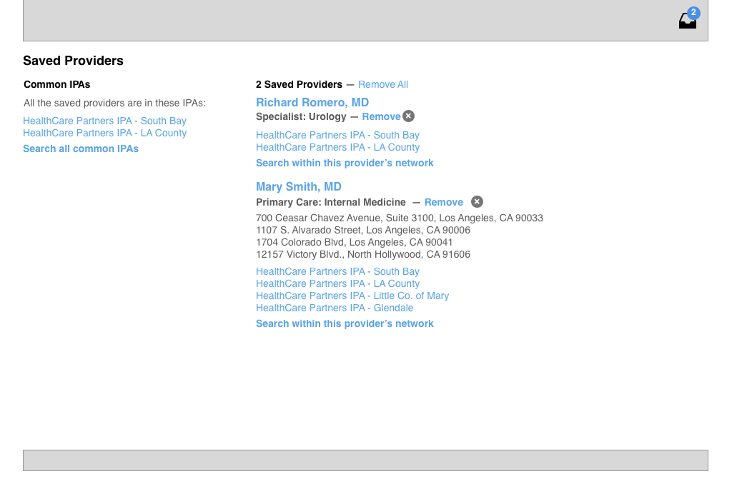
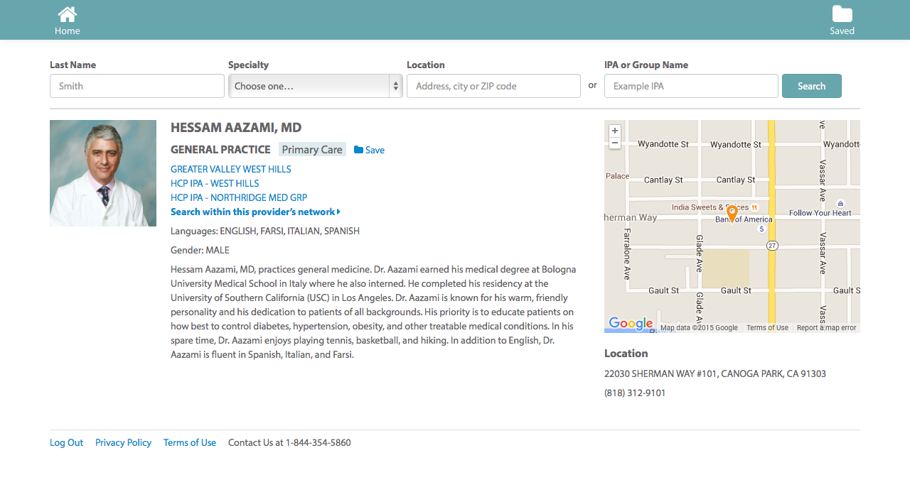
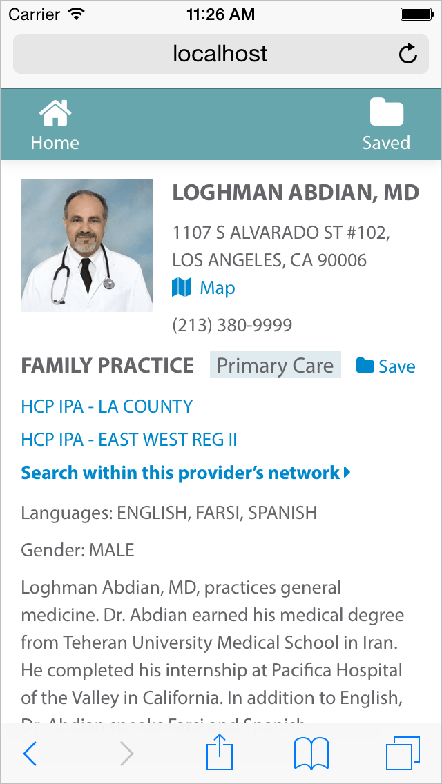
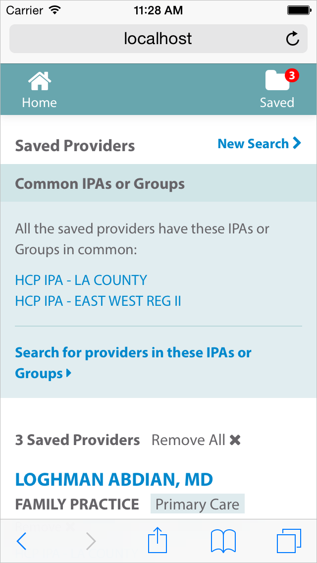
Business rules at the company organized the physicians into different groups, called IPAs. A doctor could belong to multiple groups, but each patient could enroll in only one. The challenge was to provide a way to visualize these networks. To help the agent and customer find a group that included all the doctors the customer wanted to visit.
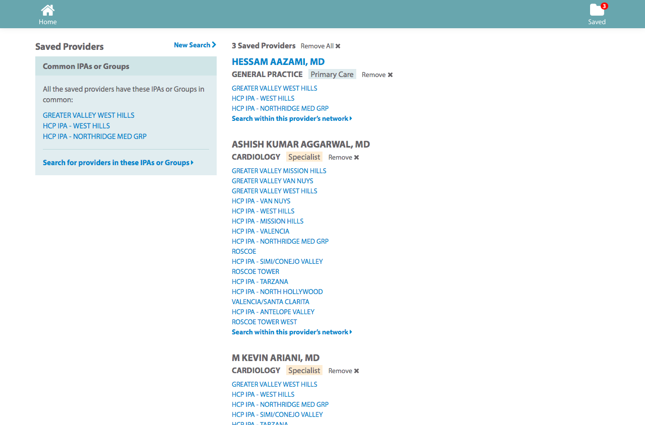
The design we settled on combines a locator with a shopping cart. You can find and save doctors. You can filter by specialty, language, and other physician attributes. For any given doctor, you can search within their network. The saved page highlights the groups that saved doctors have in common, and displays a warning if there aren’t any.
The salespeople envisioned sitting down with a potential customer and using the site together. The salesperson would ask questions and operate the site, and share the results on their laptop, tablet, or mobile screen.
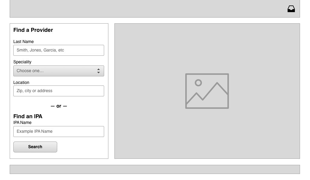
Wireframes
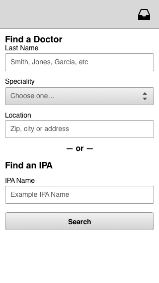
search page
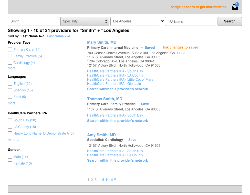
The wireframe below shows the save interaction. The link changes from “save” to “saved” and the count in the header increments.
results page, initial view
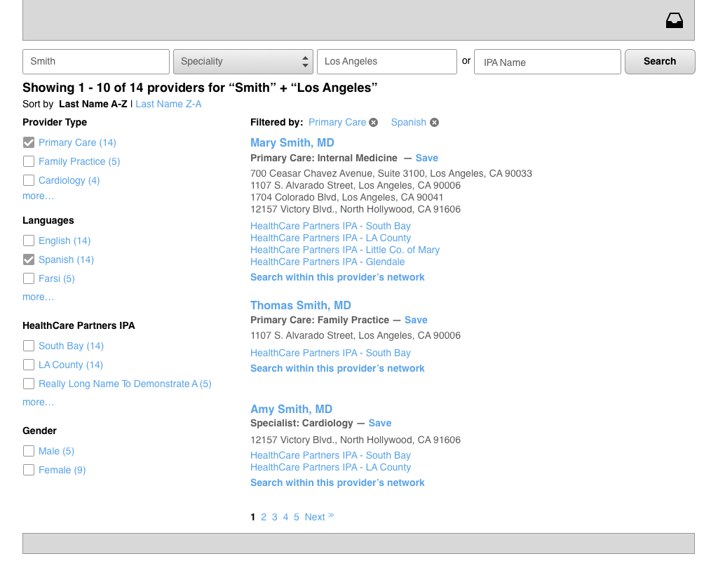
results page, filters applied
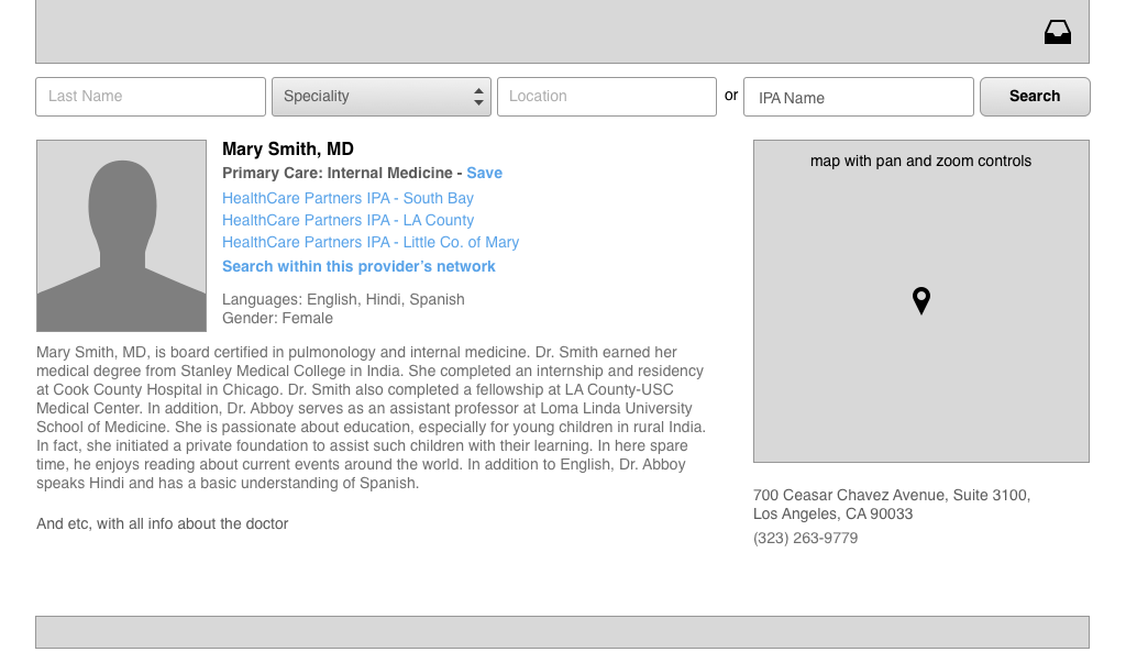
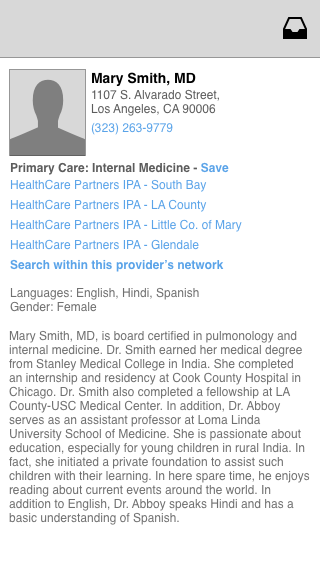
physician details page
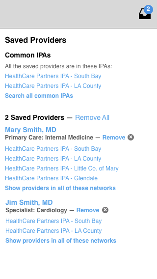
the saved providers or “cart” page
The left column shows the groups or IPAs that the collected physicians have in common. The customer would be enrolled in one of these groups.
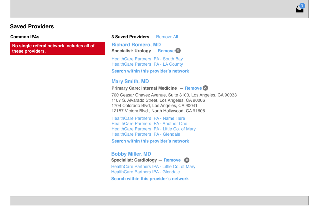
the saved providers page, showing an alert
The saved providers might not share a group in common, in which case the sale is more challenging. The customer will need to choose different doctors if they want to enroll.
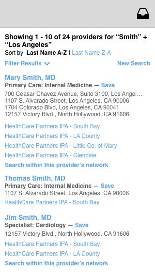
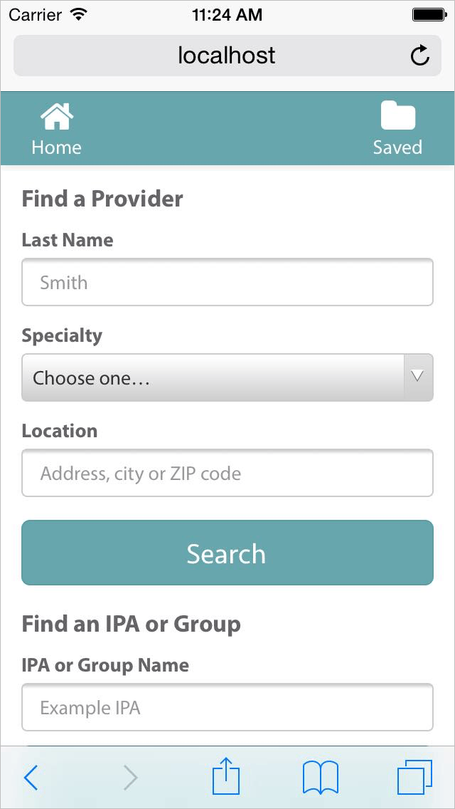
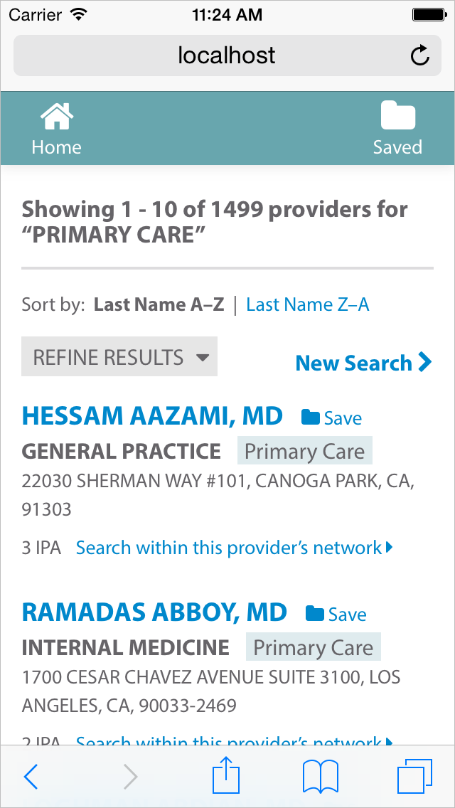
mobile wires
The Site at Launch
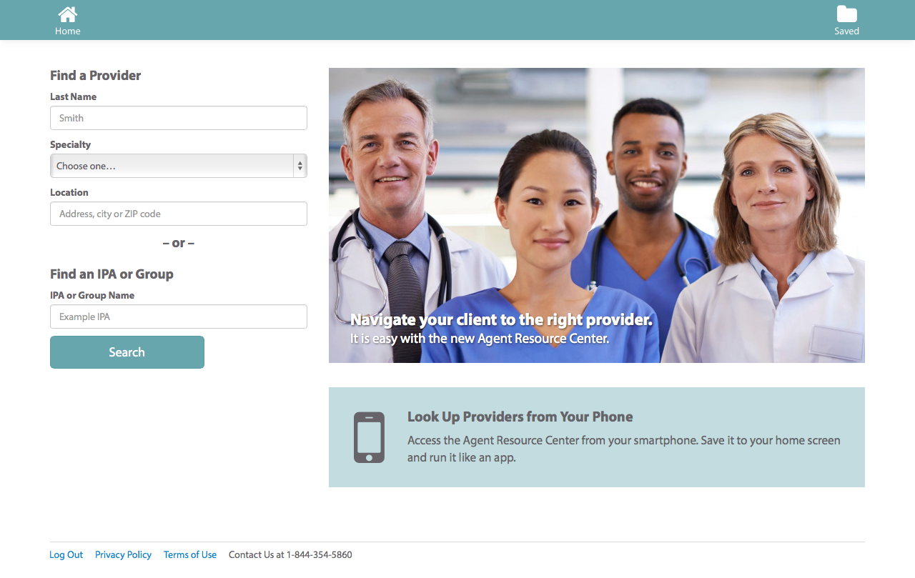
search page
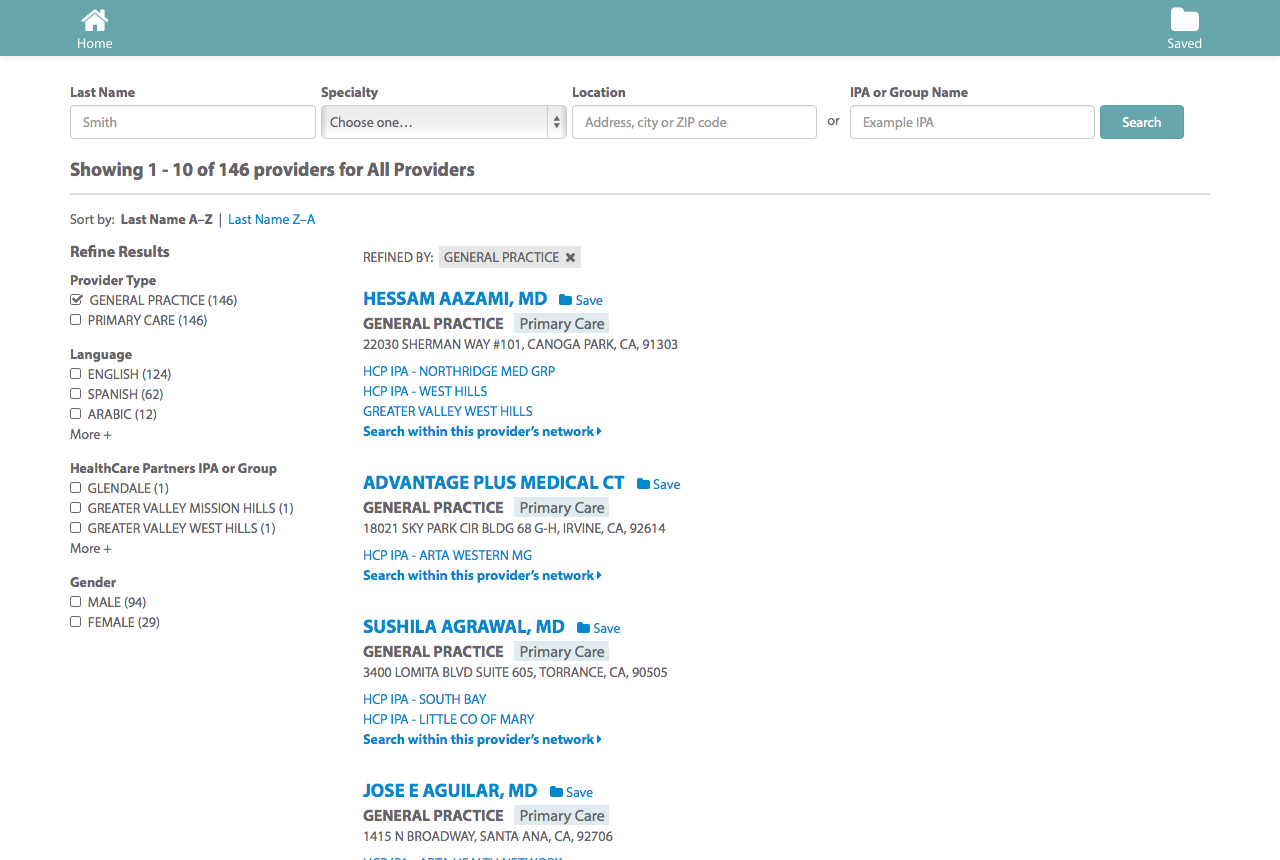
results page
details page
saved providers page
mobile screens