What We Learned
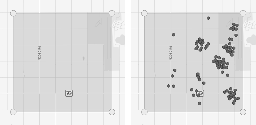
The key learnings from the interviews were that searches could be slow, and that they often returned a lot of records, often more than could be mapped. (Result sets with more than 50,000 records cannot be mapped in the application, to keep memory and CPU usage with reasonable bounds.)
These two problems were related. The larger the result set, the slower it would load. Users had internalized these constraints and were working around them. They talked about searching “the largest area possible”, or querying shorter time frames than they ideally would, to limit the number of records returned and speed up the process.
When searching an area on the map, then results are not added to the map immediately. Instead, they load into a spreadsheet-like view first. In this view, users can filter the data and then map it. But this process was also a bit time-consuming. Often, the user would have to wait for the initial data to load before filtering.
Avoiding this slowness and providing tools to filter the data without waiting for the entire set to load were key takeaways. It also became clear that allowing users to query the data based on its attributes would be useful, and this informed the design of what we called the query builder.
Another thing we learned was that the language used in the app, while confusing to folks outside the oil and gas industry, made sense to its users. In our interviews, we heard users using these terms, and when we asked them directly about it, they explained that they were industry terms. One participant pointed us to a website that provided a glossary of industry terms, which helped validate the language used in the app.
Wireframes
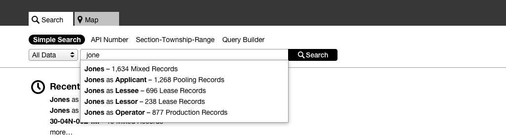
Search field with auto-complete menu
The menu helps the user narrow their results, allowing them to search a single data set using common attributes.
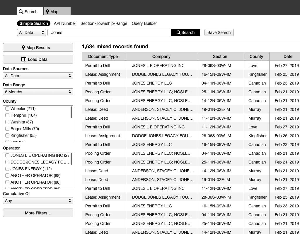
Results are shown in a table, similar to the display used elsewhere in the app.
The dropdowns and check boxes in the left rail allow the user to filter the results set. The app uses Elastic Search as a data store. I knew from previous projects that Elastic Search can surface refinements from the entire result set, even when only displaying a single page of results.
Mutually exclusive refinements are presented in a dropdown, while check boxes allow the user to apply multiple filters from a single data attribute.
Section, Township & Range Search
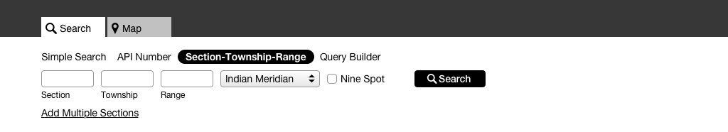
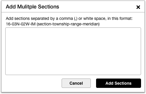
Interface for searching by section, township & range
The modal allows the user to enter multiple sections. The field intelligently parses the input, allowing users to copy and paste from spreadsheets and other sources.
In much of the U.S., land parcels are divided into townships, which are squares six miles on a side. These are further subdivided into 36 sections, each of which is a mile wide. (This is based on the Public Land Survey System.)
In legal documents, these are typically abbreviated like 30-04N-06E-IM, which refers to Section 30 of the Township at 04 North and 06 East of the Indian Meridian. (The meridians are north-south lines that were chosen somewhat arbitrarily when the states were formally surveyed.)
It’s pretty common to want to search for a specific section of land, as it might be referenced on a legal document, like a deed or lease. The check box labeled “Nine Spot” expands the search to the eight contiguous sections surrounding the one specified. (“Nine spot” is opaque to those unfamiliar with it, but the term is commonly used in the oil and gas industry.)
Query Builder
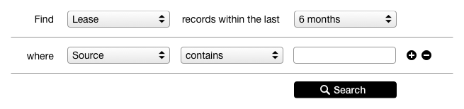
This wireframe shows the initial state of the query builder. It’s shown here out of context. We explored several different approaches to presenting this UI in the app, but the basics of the query builder UI were constant.
inital state of the query builder
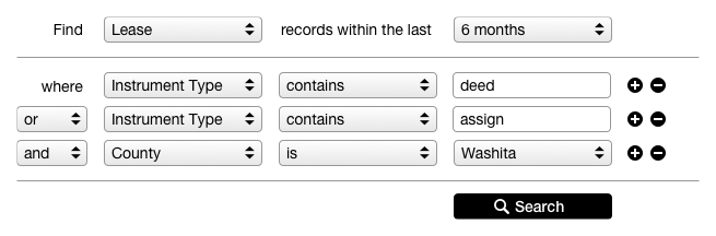
a more complex query
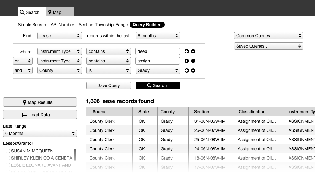
The query builder in the app.