Our Process
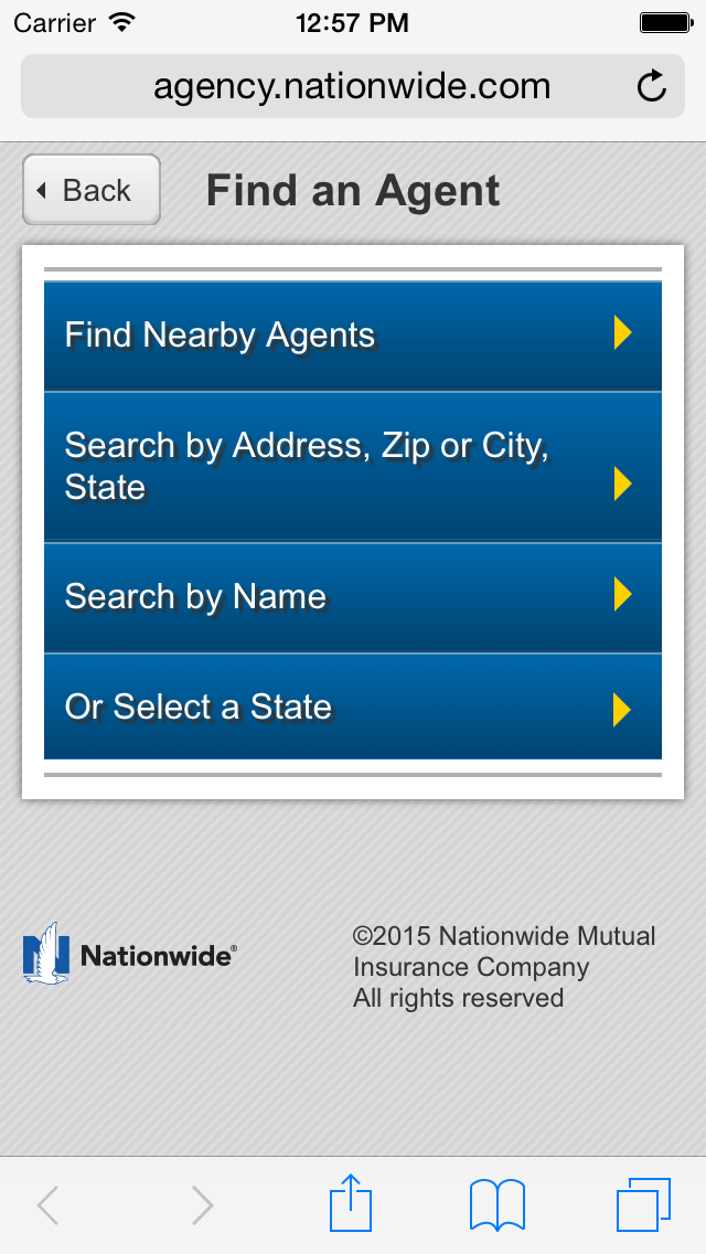
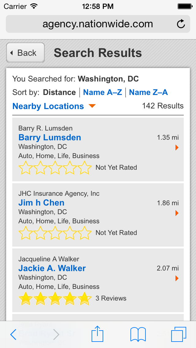
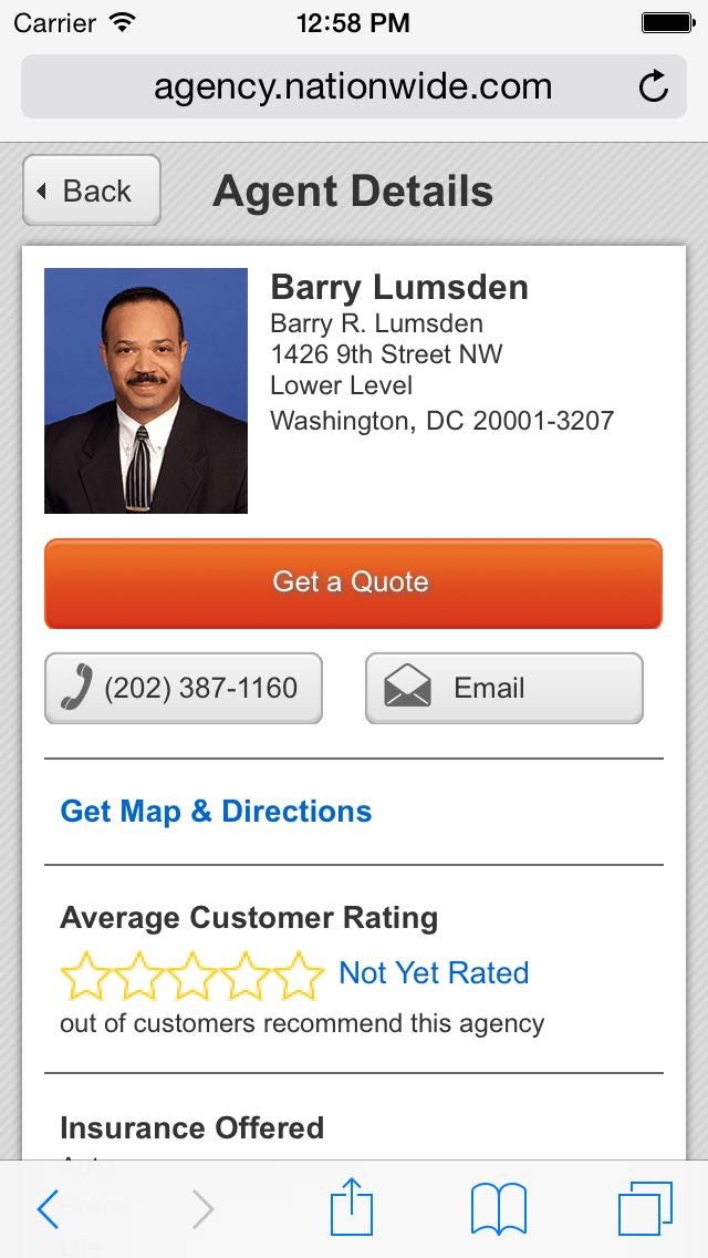
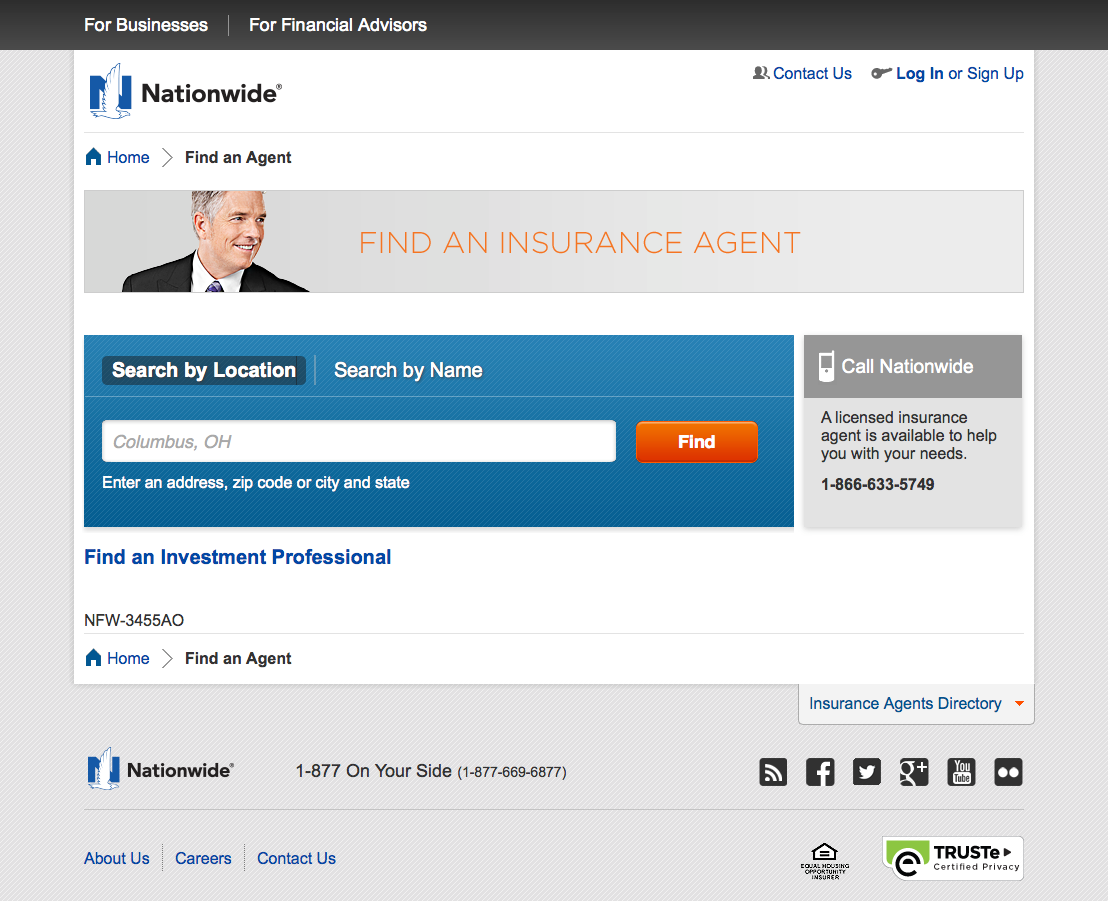
I led the design of this agent locator, working with Nationwide’s excellent in-house UX team. Their UX department was huge, like 55 people, if I remember correctly. I worked mostly with one of their UX designers and a researcher, both of whom had been working on an updated version of their mobile app.
The Placeable team was very strong in local search. The key parts of our team had all worked together at Local Matters, a Denver company that built directory sites for yellow page companies all over the world. We had a good idea of what users wanted in a locator, and how to make it search engine friendly.
We worked mobile first. I created all the wireframes. We were very closely aligned in how the pages should work and what features were key. Their research meshed well with our understanding of what people wanted in a locator. It was an easy and productive working relationship.
The design timeline was aggressive but workable. We spent 4 to 6 weeks wireframing. We had periodic design review meetings with a larger team of Nationwide folks, and I led these, explaining the thinking behind the designs to the larger Nationwide team.
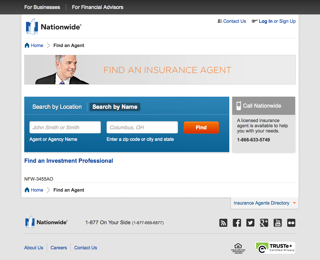
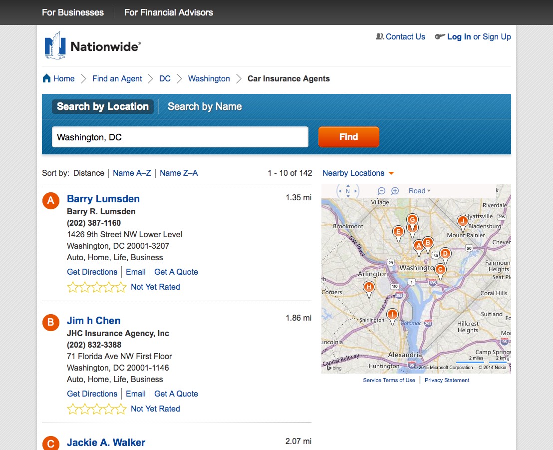
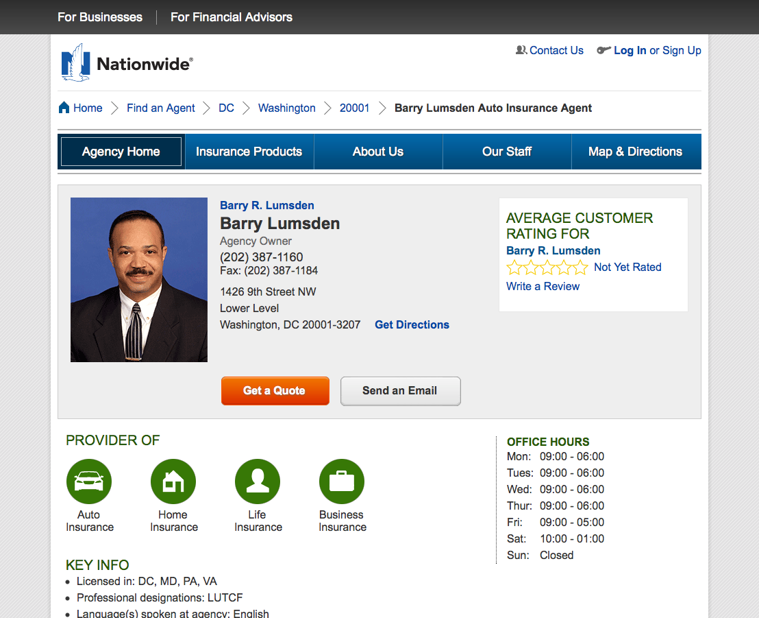
After the wireframes were complete, the Nationwide team created the UI designs. They were in the midst of a site-wide redesign, and they basically applied their new design language to the wires.
After the comps were complete, we created clickable prototypes that were usability tested in their lab. Both the mobile and desktop designs were tested. They had a great lab and a really skilled tester running the sessions.
I was on hand in their headquarters in Columbus, OH to observe the testing. The designs tested well. Users were able to find agents, they understood how the pages worked, and were able to accomplish all of the key tasks we identified.
